What Super Mario Odyssey taught me about Usability

When was the last time you noticed how useful and easy it was to use a product? Maybe it was a tool you use everyday, a site you frequent often, or most likely a video game you got addicted to during quarantine!
Like many others during these crazy times, I’ve been spending a lot of time gaming on my Nintendo Switch. As a PM and a current design student, I am very conscious of the user experience of these video games and always think about ways it can be improved.
One of the games I’ve been absolutely loving is Super Mario Odyssey — one of the best Nintendo Switch games in my opinion.
Spoiler Alert: Obviously, I’m going to be discussing a lot of this game so please do yourself a favor and play this wonderful game. And sorry not sorry in advance if you get addicted..oops.
The granddaddy of UX, Jakob Nielson, came up with 10 general principles for interaction design. These principles can be placed in 5 broad categories: Learnability, Efficiency, Memorability, Errors, Satisfaction.
Let’s take a look at some of these principles and see how they apply to Super Mario Odyssey.
Learnability
Learnability is how easy a product is to learn. One component of learnability I want to call out is Feedback.
While playing Odyssey, I found myself asking a lot of questions throughout the game — Am I on the right track? Am I going the right way? Did I collect that power-up item? Where’s the next Power Moon?
Every time we perform an action we expect some sort of reaction — confirmation on whether the action was successful or not. This indicates to us, the user, that our action was received by the system and is being acted upon. It allows users to feel in control of the system by communicating the results of a user’s action in a visible and understandable manner.
This is called Feedback my friends and allows the user to learn more and more about the game as they progress & interact with the system. Now let’s look at how Odyssey achieves this.
Feedback in Super Mario Odyssey
In Super Mario Odyssey, the use of immediate feedback is present through haptic, visual, auditory and other sensory experiences. Odyssey uses haptics as a way to hone in on hidden Power Moons. A player’s joy-cons will rumble when walking through certain grounds signaling to the user that a Power Moon is near.
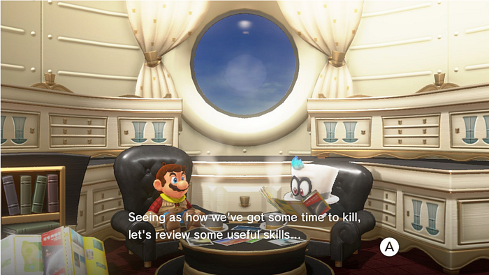
The user also gets immediate feedback from Cappy — Mario’s trusted ally and sidekick in the form of a cap. Throughout the game, Cappy is there to guide the player towards their goals. Feedback from Cappy comes in the form of speech bubbles where he will tell you if you’ve missed a Power Moon in a specific area or provide hints to defeat a boss!

Memorability
Memory is both knowledge in the head and knowledge in the world. A good design will reduce the user’s memory load by making objects, actions, and options available.
In Odyssey, the user goes to a continuous onboarding process with the game instead of a lengthy upfront tutorial that unloads a bunch of instructions and overwhelms the user. Through contextual onboarding, the user is shown the right message at the right time which allows them to ease into the game.
When first playing Odyssey, the user is immediately immersed when they arrive at the first world — Cap Kingdom. In this kingdom, the player is taught the basic game mechanics and goals in an immersive environment. The player is only introduced to essential moves such as regular jumps, capture, and ground pounds. As the game progresses, players are introduced to additional moves such as cap spin, throw, side somersault etc. As a user myself, I appreciated being introduced to new moves in small increments at relevant and meaningful points during the game.
This helped me with my memorability of the game as I was shown how to perform certain moves when it became applicable and was notified of new moves by the system as I progressed in the game. Cappy, my trusted sidekick, was also there to remind me of moves, or provide hints to steer me in the right direction.
Error prevention
In digital products and games, error prevention is always ideal but is also inevitable most of the time.
Like we discussed before, feedback when given during the right time, can help the player learn and understand the game better. On the other side, when the system doesn’t react to a player’s actions, an interaction can lead to unnecessary repetition of actions and errors.
In Odyssey, the player’s health bar on the right corner, gradually empties in response to contact with enemies or other harmful objects. The player now understands the negative effects and will learn to avoid the same actions in the future. Cappy also provides corrective and informative feedback to the player to steer them in the right direction.
Error handling in digital products — especially games — can be a useful tool in offering guidance to the user and aiding them in correcting the error. The key here is to provide a helpful path away from errors (while also educating the players) rather than punishing the player for incorrect actions.
Conclusion
Super Mario Odyssey does a great job of teaching us how to play in a way that feels exciting, fulfilling, and piques our curiosity and motivates us to succeed.
As UX Designers, it’s important for us to pay close attention to design patterns so that we can apply it in our own work to create meaningful and exciting experiences for others.
Thank you so much for reading. Let me know what your UX takeaways are for Super Mario Odyssey or any other of your favorite games!
